
The Block 2026 redo rooms and kids rooms have been revealed, and I have to say, I do enjoy redo room week. It’s a good opportunity to see which room they selected to make right, what they did to make it right, and if it actually made it right at all.
Some teams were successful, others made almost no changes, and when it came to the kids room a few took the interesting approach of not staging a kids room at all. Let’s unpack this madness!
Scroll on as I drop my designer truth bombs on The Block redo rooms and kids bedrooms reveal. And as always, drop me a comment at the end of the post or jump over to Facebook and Instagram to let me know your take.
Courtney and Sev Came First

Above: Living Room Before. Below: Living Room After
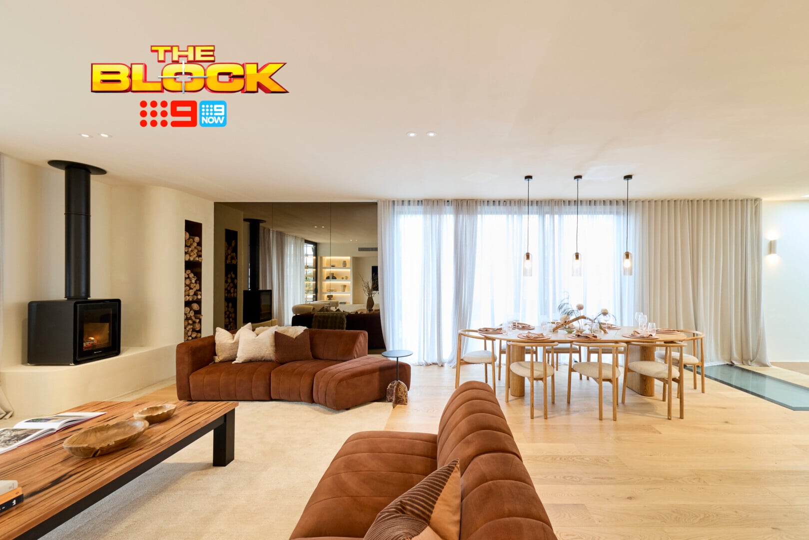
The Redo Room Brought Change, And New Issues
I wasn’t a fan of the mirrored wall in Adam and Jolene’s living room, and I’m not a fan of it here. Although, not having the glass tinted has reduced the retro vibe for me. It feels a bit moodier and more elevated here than in house one. Hey, if you’re going to copy another idea at least make it your own – and Courtney and Sev certainly did that.
On the positives, this redo room shows that using some of the same furniture and simply changing the orientation can make a huge difference in a space. I’ve talked here before about how to orient and open plan living room and they’ve followed a lot of those rules.
That said, the position of the fireplace is bonkers. I have a long list of design crimes and this is being added to it. What purpose does it serve exactly? The person sitting in front of it is melting like they’re in the House of Wax (arguably Paris Hilton’s best acting work – and by best I mean worst), while everyone else is left with no room to stand in front of it. It makes no sense.
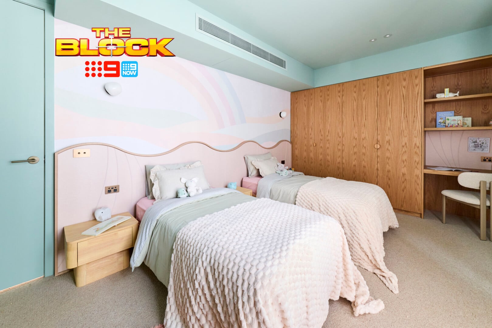
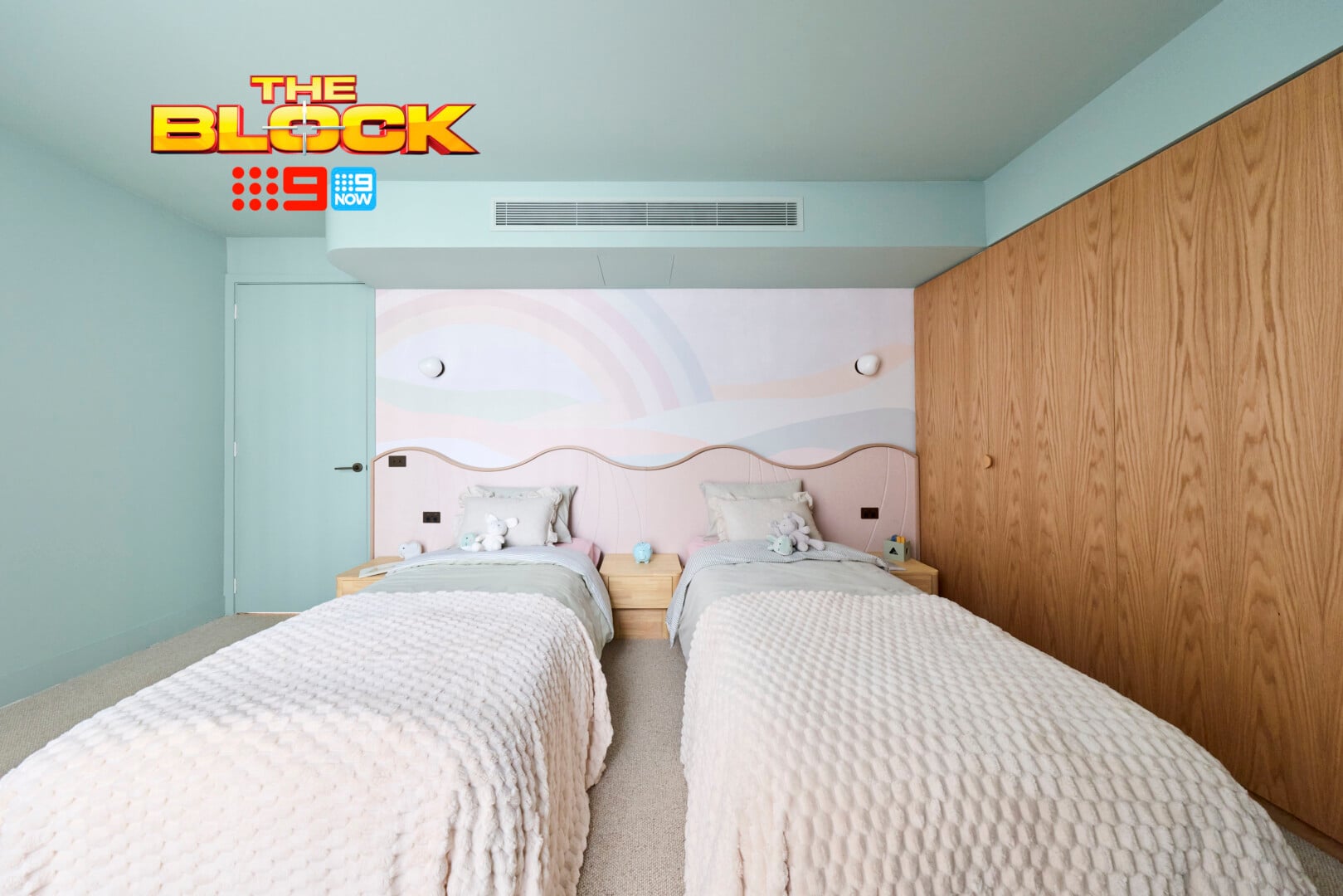
The Kids Bedroom Lacked Design Cohesion
It’s my firm belief that kids rooms, at least when selling, need to feel cohesive and reflect the over-arching style of the home. Courtney and Sev’s kids bedroom is such a departure from their usual style that it bears no resemblance to anything else they’ve delivered. That to me is not successful.
These two have been the queens of neutrals. It would have been so interesting to see them take on a pared-back nursery or kids room. We didn’t get that. What we got was an explosion of colour, shape and pattern than feels rather haphazard.
The headboard is the moment in the room; I love it. But it’s completely lost amongst the wallpaper above it, the raw-feel wardrobe finish, and the colour-drenched ceiling. Let one thing be the hero and design around that. Here, there’s a cast of heroes all vying for attention. I have to say, I’m surprised they received a perfect score.
Lisa and Rosco Came Second
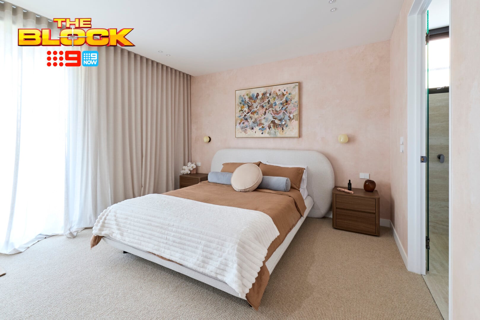
Above: Guest Suite Before. Below: Guest Suite After.
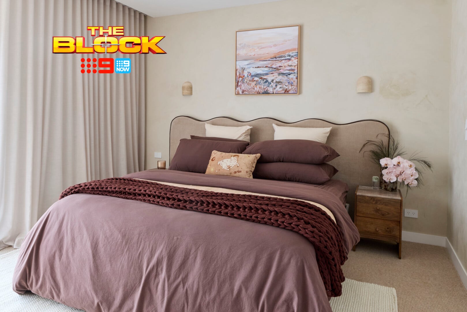
The Redo Room Was Hugely Improved
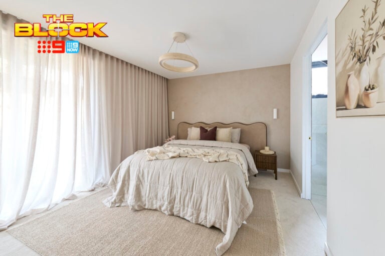
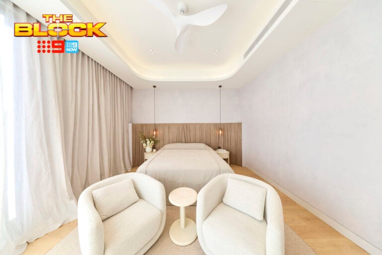
To quote Doctor Alban in the best pop song of the early nineties, Sing Hallelujah! Lisa and Rosco chose the guest suite as their redo room and it is a very successful transformation.
The ‘before’ of this room had almost no redeeming features. Now, it feels incredibly connected to the approach they took in their main bedroom, plus there’s a great sense of cohesion to the other rooms in the home.
I can barely fault it (I said barely). The bedding is delicious and styled to perfection. The bedside tables are dreamy. The wall light swap-out was necessary and looks great, and the change in wall colour has helped dramatically. I also have to say how in love I am with that wave headboard.
My one and only gripe is the square artwork above the bed. It’s either landscape orientation or perhaps nothing at all.
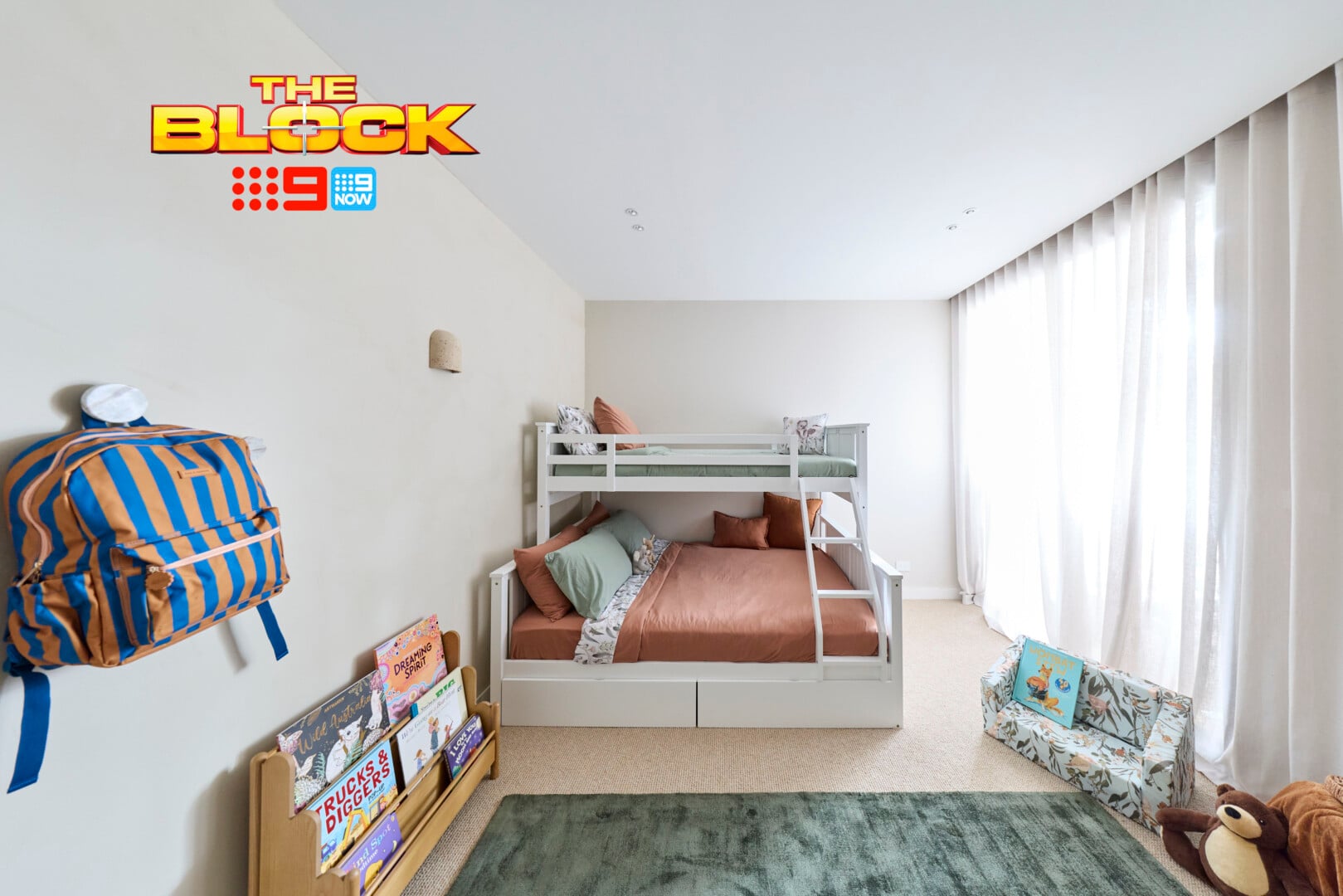
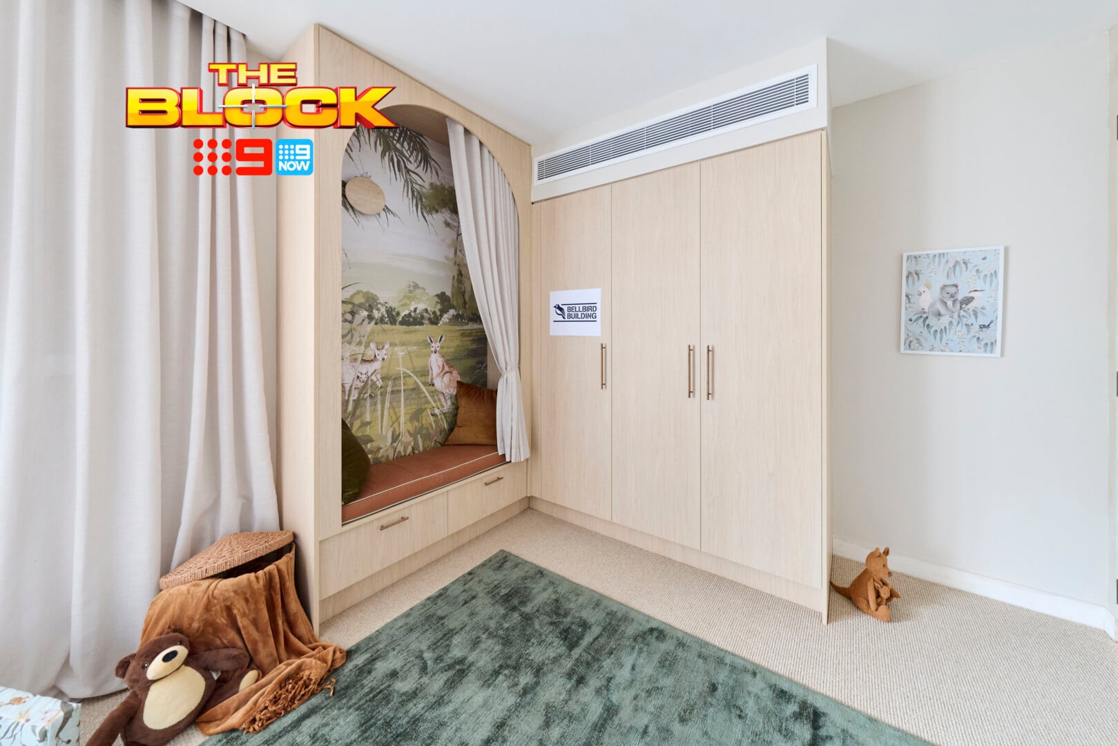
The Kids Bedroom Was A Tale of Two Sides
I won’t lie, I’m underwhelmed by this kids bedroom. Lisa and Rosco have produced some stunning spaces but this isn’t one of them. The problem is where the focus has gone. One side of the room looks laboured over; the bench seat area has had a lot of thought applied. And then we have the other side; here’s a bunk bed against a white wall.
Bunk beds aren’t selling a room, I can tell you that for free. I have specified some glorious ones in my time (here’s a list of my fave bunk beds), but we can all agree that nobody is looking at that side of the room and feeling inspired. Two single beds would have made the space feel larger and more open, plus afforded them more space for wall art.
I find the upholstered bench seat with curtain confusing. Is it meant to be a play area? A stage? It doesn’t seen ample enough to be used for that but it makes little sense as a bench. An adult can’t sit in it and read with their child. If the buyer has no kids this corner doesn’t have the versatility to allow for easy change either.
Great idea for your own home, but not to sell this one.
Adam and Jolene Tied for Third Place
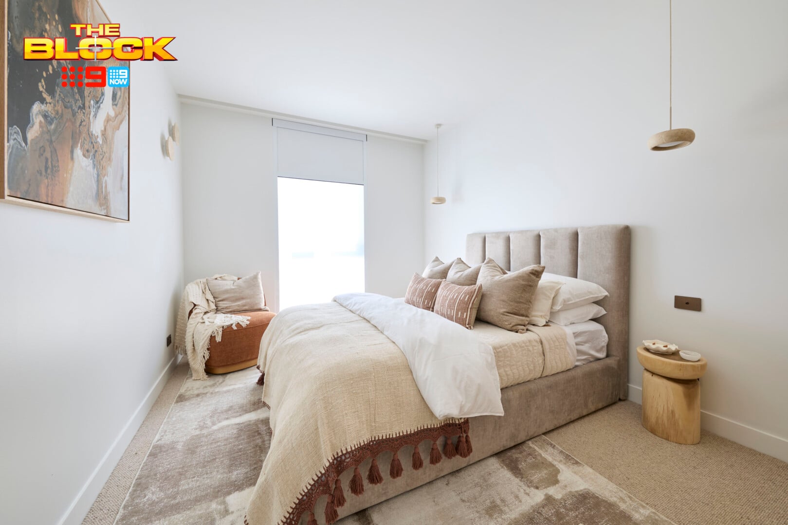
Above: Guest Bedroom Before. Below: Guest Bedroom After.
The Redo Room Had No Positive Change
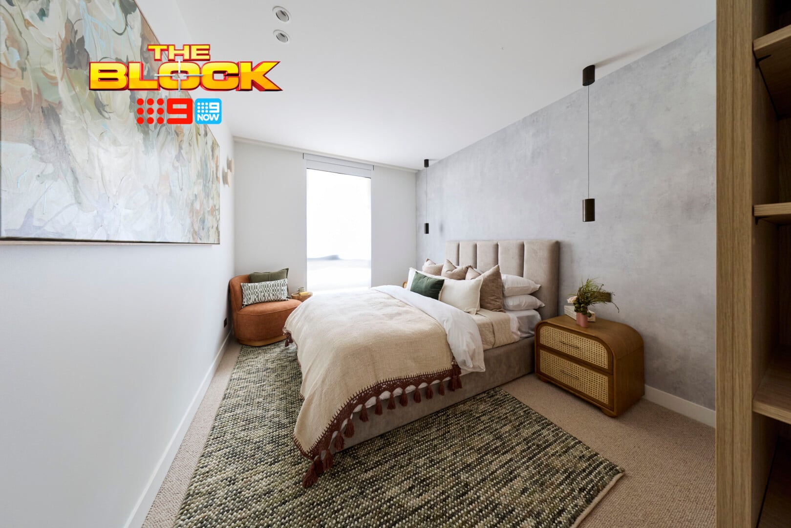
I can’t say the changes have helped the redo room for Adam and Jolene. At least it’s a bit fuller. The first time around the space felt under-cooked and too white. Now, it’s definitely not white, and there is more going on, it just doesn’t feel particularly worth the effort.
The original room needed some wall panelling, a curtain, art above the bed. It was missing layers of texture. That’s why it felt so lifeless. It didn’t require a swap in rug, in bedside table or in pendant light. It didn’t require a newly dressed bed either. It seems they are confused with why this room needed re-doing, threw a bunch of new items in it, and hoped it would work. Sadly, it has not.
The wallpaper and rug are clashing in the space. The colour palette, initially soft and soothing, is all over the place. And as the judges pointed out, the armchair you can’t walk past is still in the corner. Not good, guys, not good.
The Kids Room Was in Fact Not a Kids Room
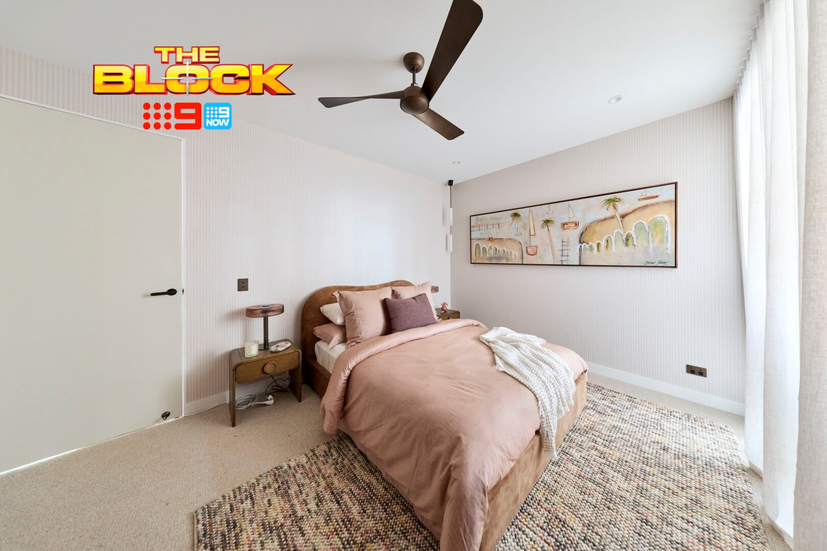
In a parallel universe where I was not a designer and was instead a contestant on The Block, I have to admit I would not put an over-themed kids room in my home either. I would make it look more teen-bedroom or second guest bedroom; both offer more versatility.
I don’t judge Adam and Jolene for going down this route. I mean, all the homes are purchased by charities anyway, right? We can stop pretending a real buyer with kids exists.
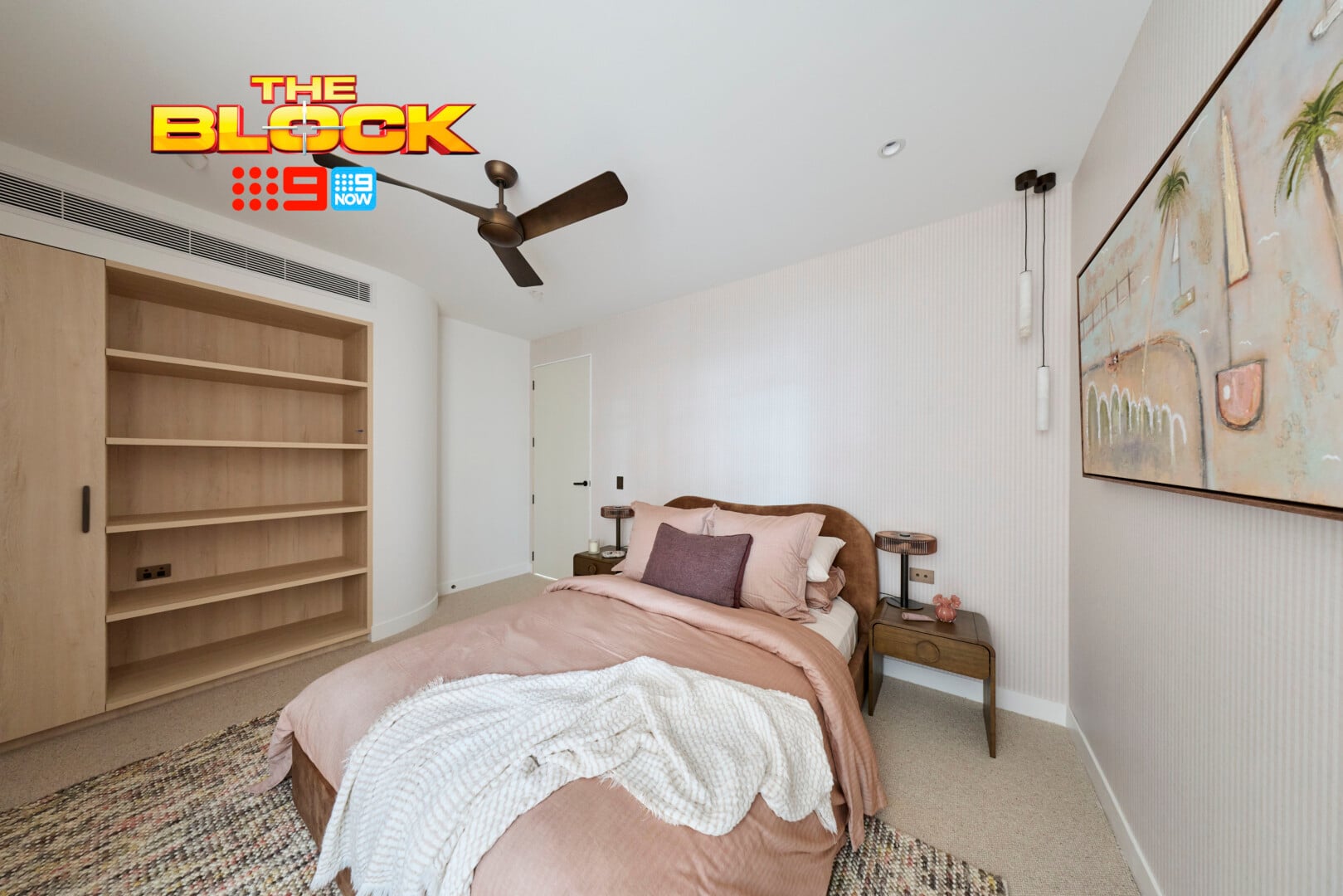
Sadly, as a guest bedroom or teenage space, it does fall short. The storage is the main concern. There’s one rather narrow robe on the left and then a tonne of shelving on the right side. They either ran out of time or ran out of gumption, because it seems like an obvious fail.
Outside of that I don’t mind the other elements. Nice colour palette, nice wallpaper. The only thing that needs removing is that odd pendant light hovering in the corner like a creep in a nightclub.
Rick and Tayla Tied for Third Place

Above: Living Room Before. Below: Living Room After.
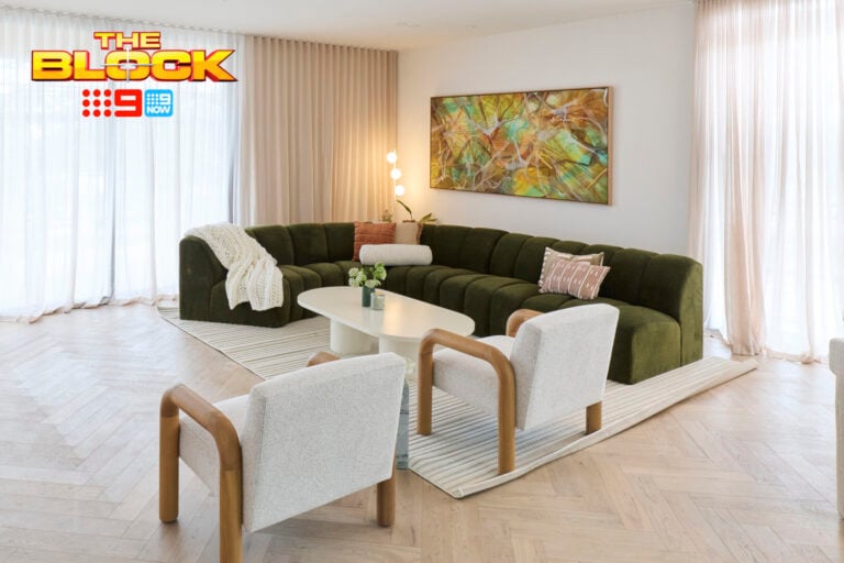
The Redo Living Room Didn’t Feel Much Better
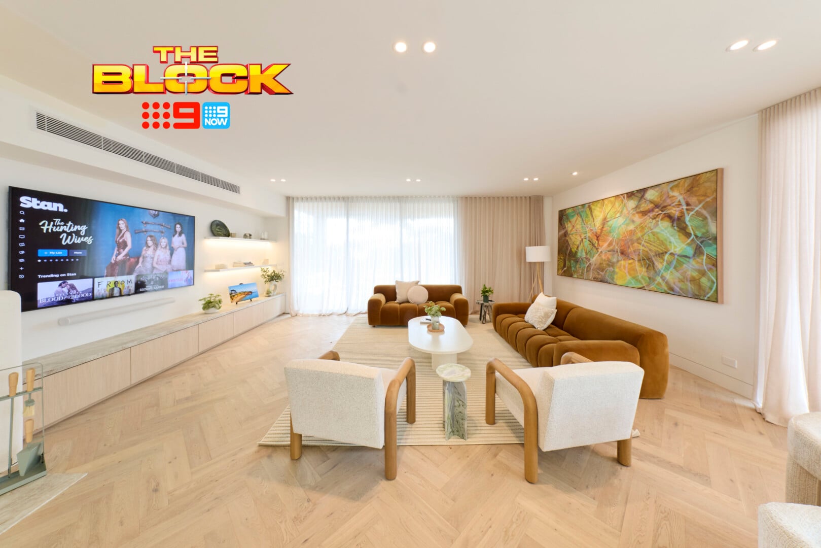
Last week I declared that the original green sofa in Rick and Tayla’s living room had reached its saturation point. So many teams have used it this season. That said, the sofa was not the issue in this space. The layout was off, the size and scale of furniture was off, and the fireplace looked like a pizza oven.
The fact they replaced the sofa and moved it off the wall does not a redo room make. The furniture still feels too small for the space, it doesn’t evoke quiet luxury and though you can’t see it above, the pizza oven is still there, I assure you.
Rick and Tayla had a lot of rooms to choose from when it came to redo week. It’s fair to say that a lot of their zones have been underwhelming. This room, with these changes, just doesn’t cut it as worth the bother.
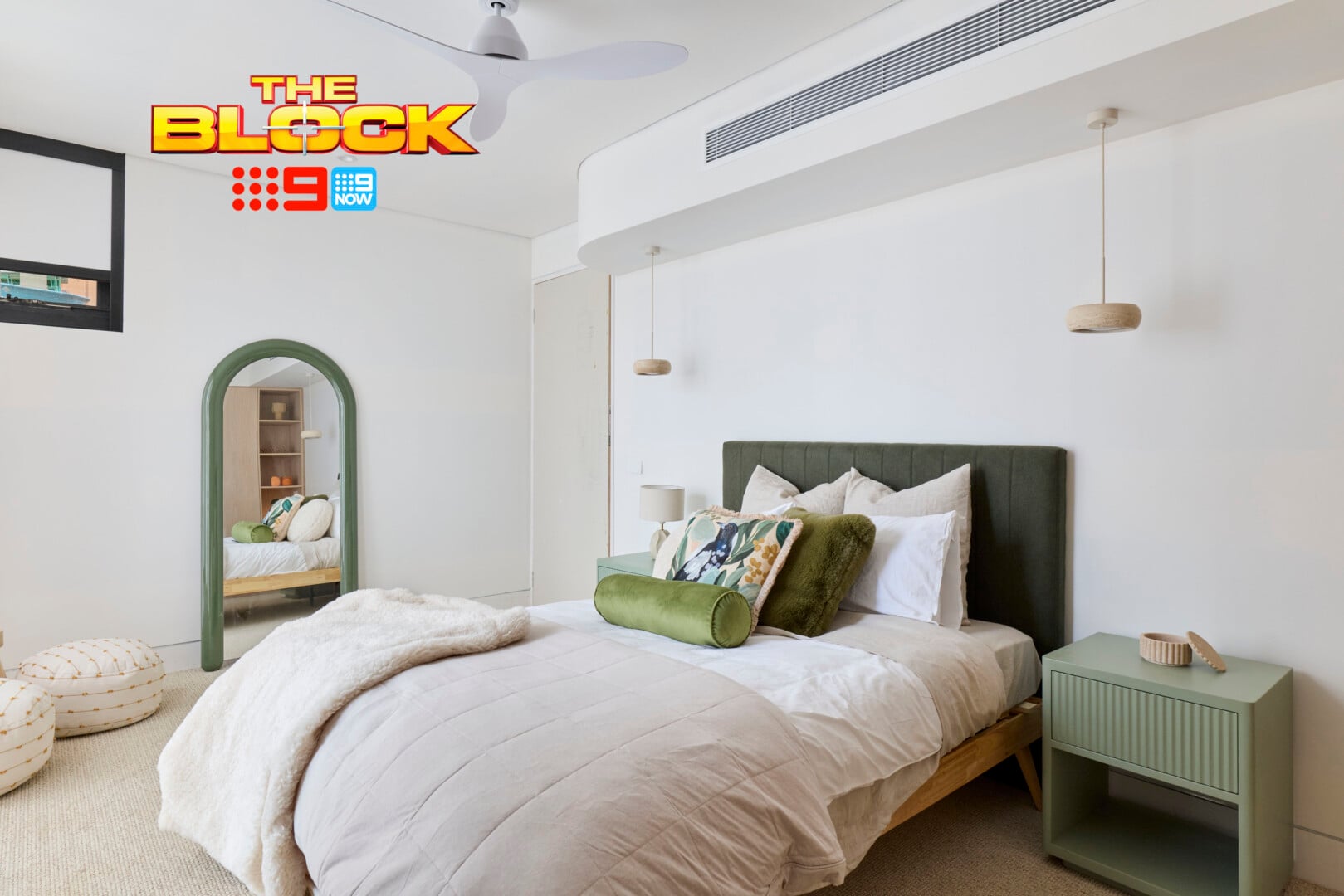
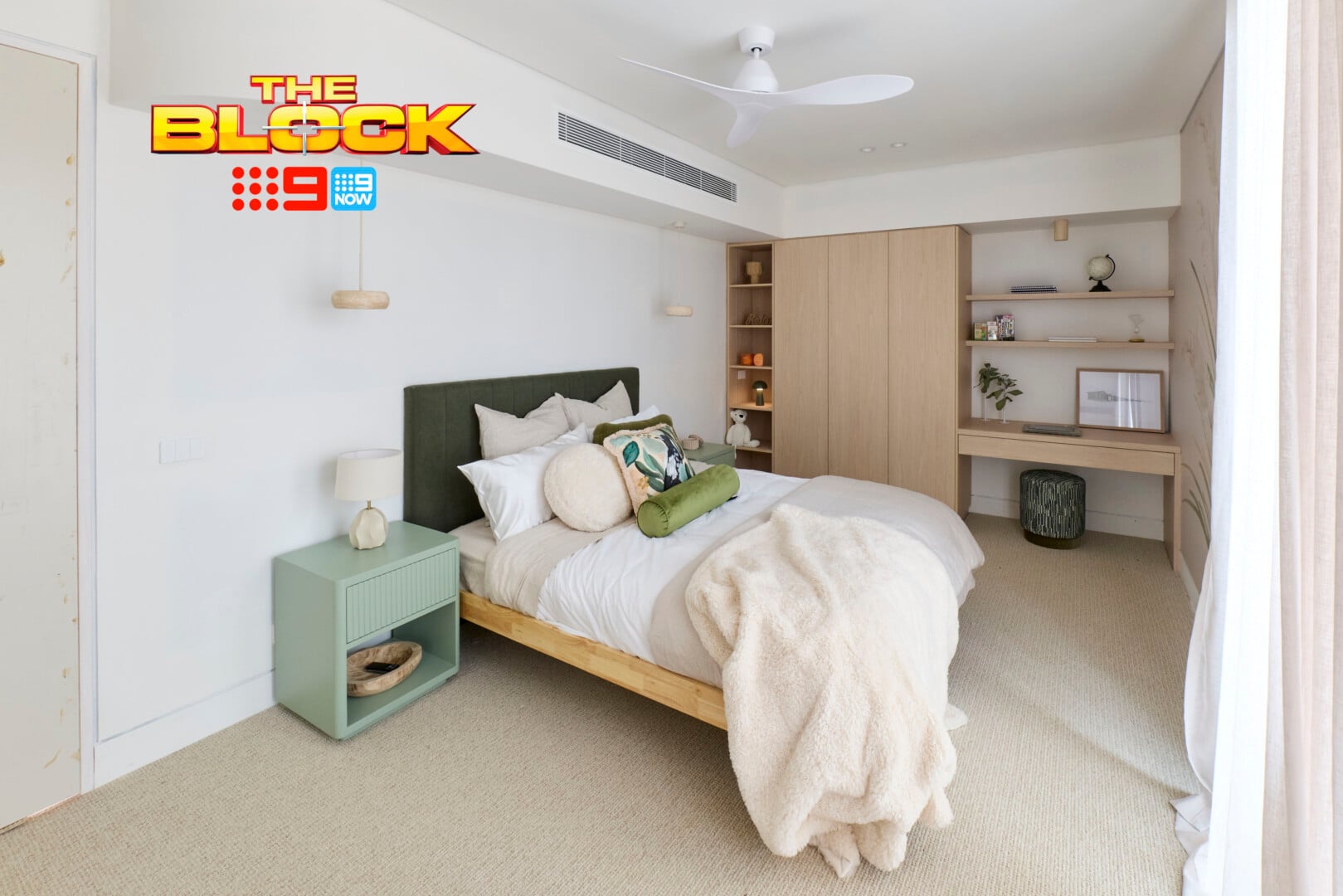
The Kids Room Was Average
I do enjoy the tone of the joinery in this space. It has a soft and soothing appearance and creates a nice vibe in the room. Functionally, it’s appreciated to have a desk zone, ample hanging space plus some cube storage. It’s a very versatile room you could use for a number of people and/or purposes.
But outside of that, it’s average. I often say this; all of the pieces are lovely (bed, bedsides and ottoman all get my seal of approval), but they just don’t go together. The room feels rather pedestrian, not luxury and not inspiring.
I also need someone to talk me through the concept of have a pendant above your bedside table and then having a table lamp on it too. This must be a trend I’m not across.
Chantel and Wyatt Came Last

Above: Living Room Before. Below: Living Room After.
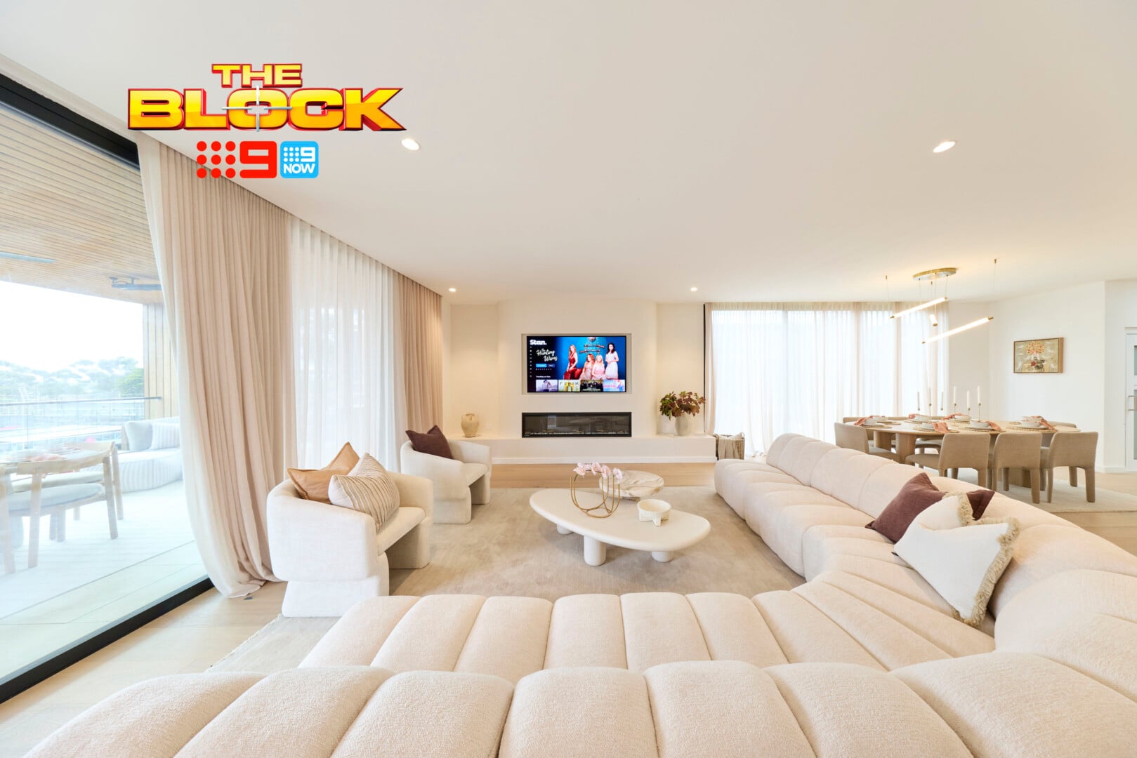
The Redo Living Room Received Barely Any Changes
They changed the orientation, added in a little more of that sofa (you know how I feel about it), and called it a day. Similarly to Rick and Tayla’s space, why bother? I don’t mind when teams dig their heels in and defy the judges advice, but if you’re going to be stubborn, take it all the way and don’t amend a thing. What can I say, I love a rebellion.
I didn’t have a tonne of issue with Chantel and Wyatt’s original living room. I appreciate the point the judges are making about not seeing the view from the sofa, but being inside the zone, the TV on that wall does look nicer than on the opposite one. Every team followed the same living room formula except these guys, and I don’t mind it at all.
I would have added in some textural variation here. Some timber side tables would have been great. The slide-over style would work well with this sofa. I also would have appreciated some taupe leather or similar in an armchair. There’s too much soft white fabric going on.
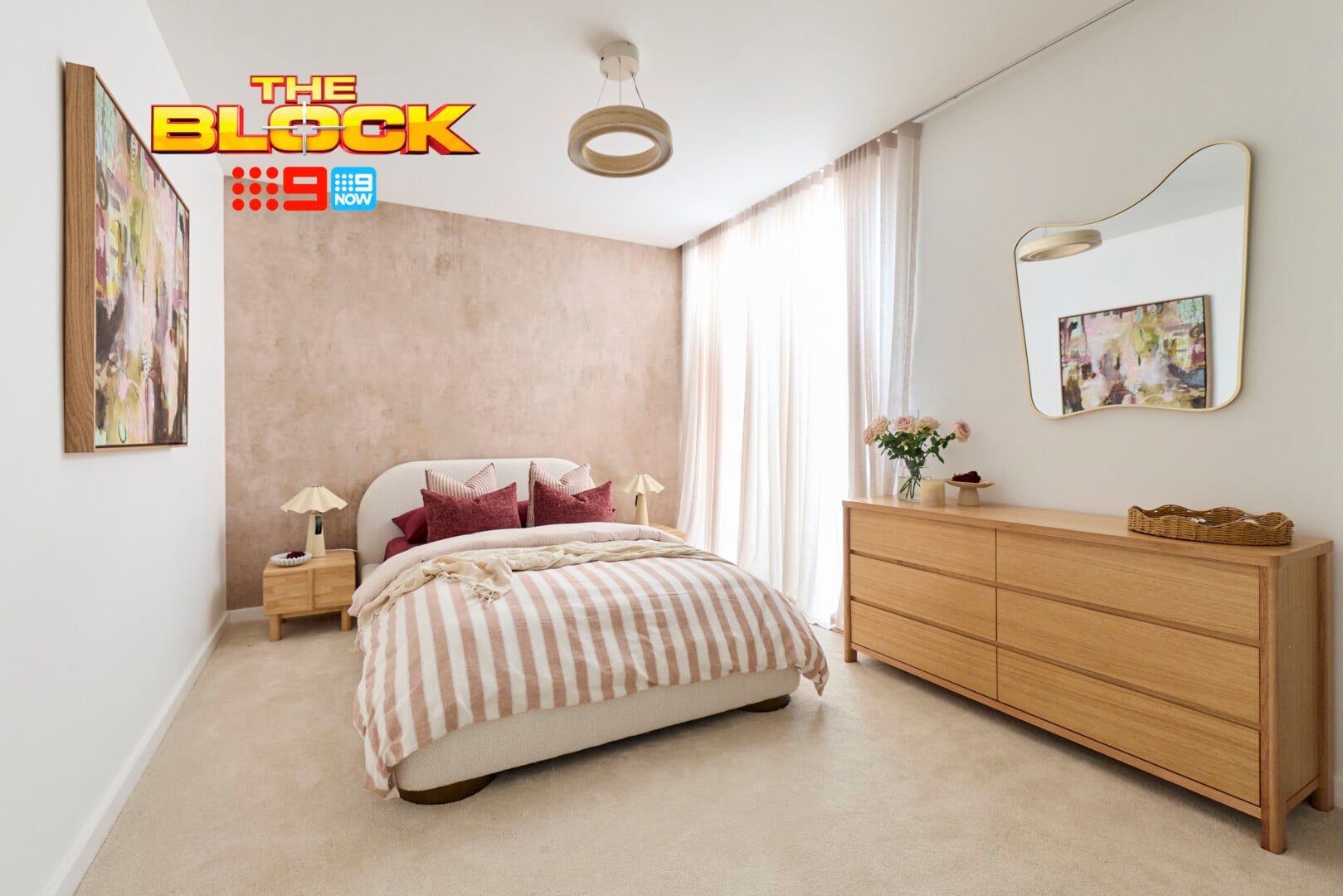
The Kids Bedroom Was Also Not a Kids Bedroom
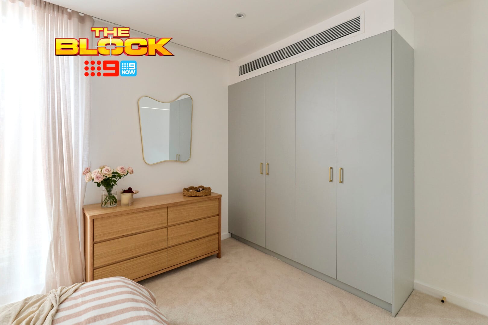
You already know my thoughts on the teams not doing kids rooms; doesn’t bother me in the slightest. But if you’re going to defy, as I said already, defy and deliver a jaw-dropping space that the judges cannot fault. This one has my jaw firmly clamped shut.
The furniture orientation is wrong, for starters. The bed turned to face the window would have looked far more successful. The wall treatment I rather enjoy, but it and the styling around it is such a departure from everything else Chantel and Wyatt have delivered. It’s a space from another house.
I don’t really understand the lowboy and mirror. It’s a weird mid-Century meets modern country moment I can’t get on-board with, and it’s not at all needed given you have a robe right there.
I have to say, the bedding, bedside tables and lamps are all delicious though and I’ll take them immediately.
All in all though, it’s a bit of a disappointing week for The Block, wouldn’t you say?
What did you make of The Block 2026 redo rooms and kids bedrooms reveal? Drop me a comment below or jump over on over to Facebook and Instagram to let me know your thoughts there.
For more on The Block, or to catch up on episodes you missed, check out Nine Now.

So far there is no room in any house I actually like. Thre are small elemants that are ok but overall this series is a dud.