The Block 2018 is back. And like me with a bottle of shiraz, they wasted no time getting into it. Night two of the series saw the 48-hour challenge reveals go down. And I have to say… I think I just experienced a whopping anti-climax.
It’s my own fault, truthfully. After a dire season of House Rules I was expecting to fall off my chair the moment The Block begun. Sadly, both cheeks remained firmly planted on the sofa. And thanks to a botox-free forehead (for the moment, anyway), I experienced multiple frowns. And then a few yawns. And now I generally feel a bit ‘meh’ about the whole thing.
I’m sure the reveals are going to get better as we go along (they better!). But to keep it real: a few of the rooms in this first Block reveal reminded me of House Rules. That’s like being Kyle Richards and being mistaken Kim (that’s a reference for all you Real Housewives fans out there). Nobody wants that!
So let’s take a look at The Block 2018 48 hour challenge below. Thankfully, I’m not mad this week. Thankfully, I don’t need a Bex and a good lie down. But I do need a coffee and a No-Doze though, because things here were pretty snoozey.

Kerrie and Spence get the ‘Almost There’ Award
What I really appreciate is finding out how much each couple spent on their rooms. It’s so refreshing. You have no idea how many people come to me asking if I can help them transform two rooms with a budget of less than $10K. It’s not doable unless everything comes from Kmart, let’s be honest.
Designer spaces come with a price tag, which is something a lot of people don’t realise. They see shows (I won’t name them) do these dramatic transformations on a crazy low budget and think it can be done in the real world. It can’t.
I hope this cost transparency follows through the entire season.
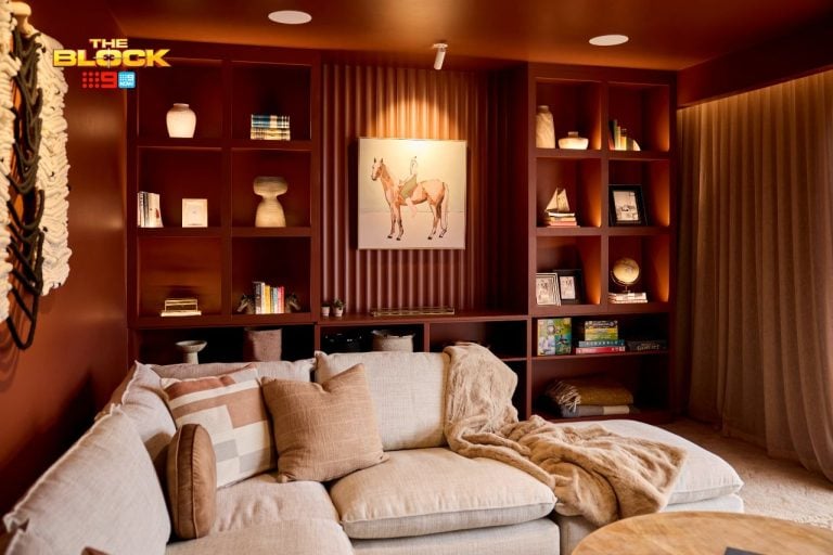
Kerrie and Spence forked out a total of $7,278 on this space. And there are some gorg moments to feast on. The colour palette I am a fan of. The timber panelling I am a fan of. That horse print is everything. But there are some issues here.
They Needed to Amp up the Personality
My main concern here is a general lack of personalisation. It feels like a small hotel room. A kind of budget B&B done up nicely by an owner who, despite not being qualified, has watched a lot of Block episodes and has a bit of a flair for decorating.
I’m also baffled as to why they squeezed such a large bed in that room. It feels so cramped and only makes the odd dimensions of the room stand out more. Some sheer curtains would have been nice. An armchair would have been nice. I also thought the desk was a miss. And the wall if was on was completely void of any design. No shelving, no art, no wallpaper. Just… a blank wall.
This room, with a few tweaks, could have been pretty lush. But as it stands, it feels like a glam backpackers room. One with a shared toilet down the hall.

Jess and Norm, I’m not that Into it
I can’t say I really like this space. The proportions are completely off, for starters. They installed a giant bed-stage-cubby zone at one end of the room and then kinda did nothing else in the rest of the space to balance it out. The room is very heavy at one end with a lot going on, and then there are blank walls with some really small artworks plonked on them.
This is The Block. These are kids rooms. Coming off the back of other seasons where some of the children’s spaces were stunning x 10, I’m a bit let down here. The room feels quite sterile and vacant and incomplete. The colour palette is so predictable, the accessories are thrown on the floor, and the shelving zone at the end of the bed felt raw and unfinished.
The Curtain needs to go…
The curtain is the issue, if I really consider how to fix this. It cuts a small room in half. If that was removed the entire room would feel a lot better. I also think the shelf looks visually bulky. How much storage do kids honestly need? Parents, you might come at me with this opinion, but really… if you need six shelves, three drawers and a wardrobe in your kids rooms, I think it’s time to declutter.
The total spend here was $5,464

It’s a ‘No Deal’ for Courtney and Hans
Sheesh. This one definitely had House Rules written all over it (sorry House Rules). Courtney and Hans spent a fair bit of cash this week (a total of $8,411) and I’m honestly not sure where it all went.
I don’t mind a general theme in a kids room. I consulted with a client last week to do a forest theme in their little girls room, but none of the design inclusions are going to be as literal as sky wallpaper on the roof. It looks more severe than the mohawk hairdo I used to rock when I was 24 (I thought I was so hot, btw).
The blue wallpaper on the roof also presented a second issue: trying to find a paint colour for the wall that worked with it. Sadly, the blue paint they used is fighting the roof colour horribly. It’s a fight so severe it could rival Carole and Bethenny’s fued on RHONY (I’ve been watching a lot of Real Housewives this week). And can we talk about that felt ball rug? Please, for the love of the decor gods, can we ban felt ball rugs in kids rooms moving forward? They’re so dated.
I want to tell Courtney and Hans to remove the therapy session bed by the window, but after the stress of looking at this room I kinda wanna lie down on it and talk about my feelings. The random baskets under the bench are so out of place too. Quite poor styling from these two.

Sara and Hayden Deserved the Win
Yes, indeed they did. But there are a few pain points in this room for me. Let’s not go neggo so quickly though. Let’s take a look at what worked in this space. Because I like to think I’m a fair and balanced judge, after all 😉
The nook in the wall above the bed was genius. I really like it. A kid would go ape for it as well. Hell, I’d like one beside my bed so I could fill it with luxury candles I’d never actually light but sniff every morning instead. It’s a really nice storage solution in such a small space, and I thought the bed was divine as well. It’s not a shape you’d necessarily think ‘child’ about the moment you see it, but I like that element of surprise.
The colour palette in the room was also enjoyable. A mix of blue and orange tones against a crisp soft grey backdrop.
But there were some issues…
I know the judges may have liked the built in desk, but for me it’s a fail. The rooms in this building used to be hostel-styled spaces, and this built-in desk just reminds me of that history (but not in a good way). Putting it in there makes this room feel like a backpackers room you turned into a bedroom. I’m not keen.
It would have been nice if they’d replaced the cheap-looking handles on the wardrobe, and if the wall beside the bed featured a subtle wallpaper. This room, as with most this week, felt a little soulless and sterile.
PS: that felt ball rug has come back to haunt me again but in a different colour! Pass me the crucifix and holy water. Total spend on this room: $10,776
Bianca and Carla, I’m on Your Side
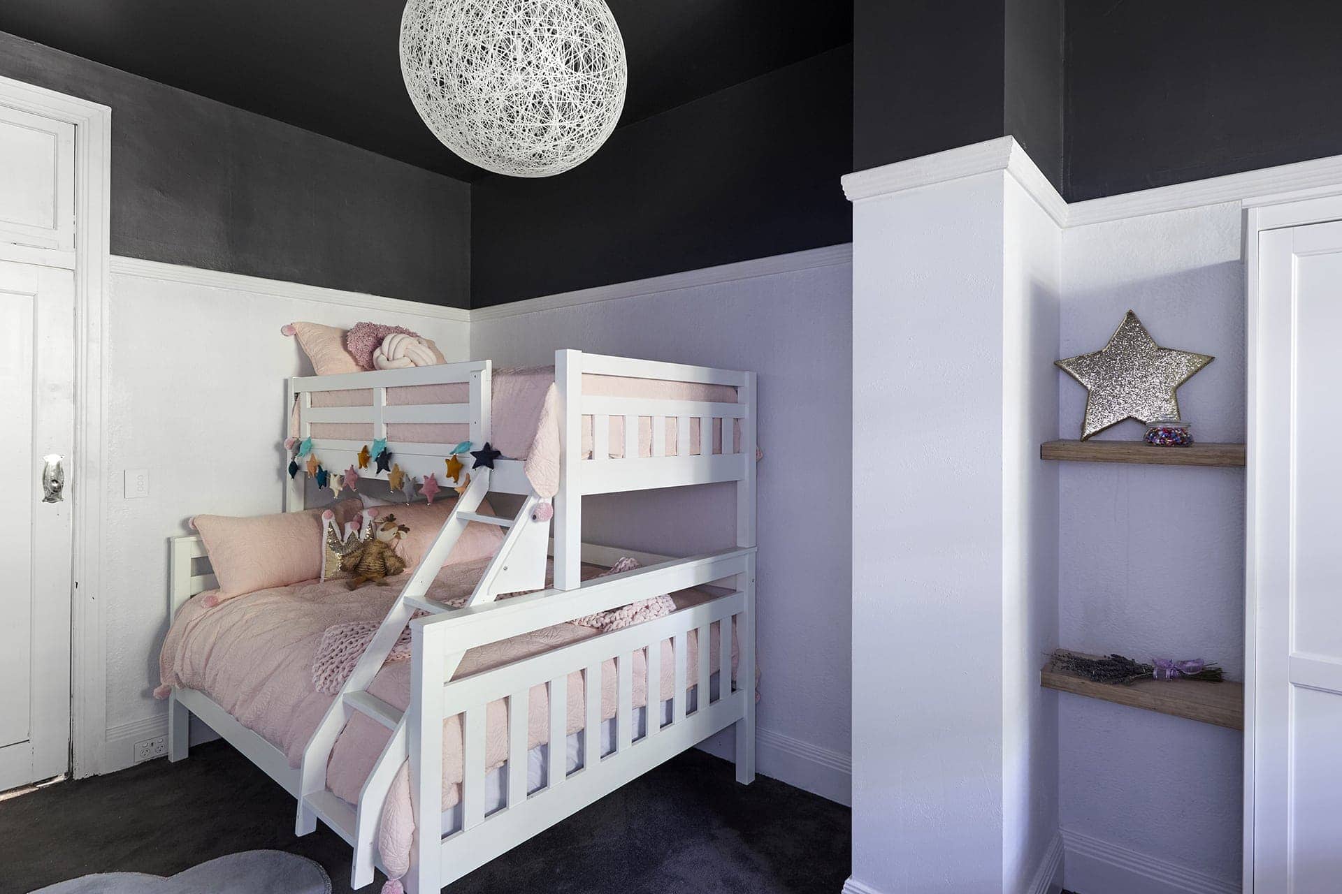
I think these two lovely ladies show great promise and I was rather pleased with the overall design here. It was a gutsy move to paint the top section of the room black but it really paid off.
It would have been so expected for them to pop in a gold Incy Interiors bed and call it a day, but I like that they went for something different here. Did they need a bulky bunk bed though? No. I wish they had gone for a king single bed here with a cute bedside table. It would have made the entry to the room feel less overwhelming. But it’s not a total fail.
I do think this room is crying out for a sheer curtain though, and it’s also asking for the star decals to be ripped off the wall. I’m personally opposed to wall decals. Just commit to wallpaper and enjoy the impact it will bring to the room.
This room just needed the whimsy turned up a little more and it would have been smashing.
Total spend for this space: $7,278

What did you think of The Block 2018 48 Hour Challenge?
What did you make of The Block 2018 48 hour challenge? You know I want you to spill everything. Drop a comment below and let me know which room was your fave and which space you thought was diabolical.


I thought it was a whole lot of nothing. The only thing i liked was that horse pic. First rooms though. Theyve already got the emotional quivering chins going and that was from the men!
LOL too much drama over design if you ask me. And yes you’re right – first rooms and a very short time in which to get them done. Fingers crossed things improve.