The Block 2018 ensuites have been unveiled, decorating junkies, and now we must critique them. Well, I’m going to anyway – and I encourage you to get involved. Because there were some moments this week I just have to vent about, and I reckon you probably feel the same way.
In life you gotta take a stand sometimes. You know, fight against injustice. Say no to terrible crimes. And speak out against harrowing atrocities. So in the interest of rallying together to fight this war, chant it with me: SAY NO TO TERRAZZO!
I simply cannot with terrazzo. It wasn’t cute originally, and it’s not cute now. It is the design equivalent of Snooki and Jwow (and everyone else on Jersey Shore): it was unsightly years ago, and its comeback is even more off-putting. This season someone is determined to make terrazzo a thing, and to that person I say: please stop.
Before we jump into critiquing each room, don’t forget that at the bottom of this post I will be announcing the winner of last week’s Block Shop giveaway. And giving you the chance to WIN another $100 voucher.


Hans and Courtney did not say No to Terrazzo
I’m pretty sure you already know my feelings on this space given that I hate terrazzo. And given that so much of this ensuite is covered in it, we’re not off to a good start.
The thing is, the white terrazzo in their master bathroom I could almost handle, but this darker version is a no-go. It reminds me of contact my mum used to cover my exercise books in when I was in primary school. The floor just needs a sticker put on it that reads “this book belongs to – ” and my year 2 flashback will be complete.
The terrazzo is even in the recesses and behind the bath. I guess you gotta give it to Hans and Courtney, they certainly committed to the material. And with that, I have to try and put my hatred for terrazzo aside for a moment to examine the other elements of this ensuite.
I do like the layout and floor plan. I like that the freestanding tub is the star moment in the space. I love that there’s a crisp and clean colour palette at play. And I do enjoy the plantation shutters. I’m also smitten with the indoor plant pots, and adore the wooden stool near the bath. Every bathroom needs a mini stool by the bath, don’t you think?
All in all though, I feel this room is a little understated and boring. If you took out that terrazzo (which I would do immediately) you don’t have much going on in here.


Norm and Jess said Yes to Marble
Norm and Jess had a smaller footprint to work with here, relatively speaking. I mean, this is an ensuite that’s still larger than most main bathrooms across the country. But for The Block, it was the smaller of the five.
Being a small room, I would have liked this ensuite to feel dark and moody. Instead, they went all out to make it feel light and bright. Not what I would have done with the design, and it doesn’t speak to the style of their main bathroom either (see what it looked like here).
It’s a bit of an odd choice really, to have the ensuite not resemble the look and feel of the master. Some continuity would have been good, don’t you think? Especially considering their master bathroom felt quite raw and organic. This ensuite is worlds apart from it in look and feel, and I’m not keen on that contrast.
The choice of marble is a fail for me. Sorry guys. It’s just far too intense. The marble vein is too dark, and there’s too much of it. To then take that marble and add it into the recess and the vanity top feels far too overwhelming in such a tight room.
To add insult to injury, the timber used in the cabinetry feels out of place against the marble and the vibe it’s creating. I’d have gone with black cabinetry to allow the marble to take centre stage. As it stands there are too many things fighting for your attention. Kinda like when the kids are in the swimming pool doing handstands and wanting you to watch (PS you always look away once they go underwater).
What I will say though, is that the black toilet paper is kinda everything and I need some in my life right now. Sometimes it’s the little things, isn’t it?


Kerri and Spence Delivered the Goods
There will never be a time in my life where I won’t flood my basement over marble herringbone tiles. In fact, I’m in the midst of trying to convince one of my clients to let me install them in her kitchen. Trust me, they are hot now and they’ll be just as divine in 20 years. They are the Cher of tiles; they just don’t date.
This bathroom was by far the best of the bunch. It felt chic and sophisticated. It had a focal point. It didn’t overwhelm the eye. They pulled back when they needed to in terms of material choices and placement. And they didn’t stuff it with too many bells and whistles on the decorative front either.
It not only looks phenomenal (adore those shutters), but it addresses functionality in a clever way too. Plenty of storage space in the vanity so everything is within easy reach. A basin each for whoever is lucky enough to live in this home. And those freakin’ mind-blowing mirrors. Shut up and take my money – I need them immediately!
The one thing I will say that didn’t work for me was the gap they left at the end of the vanity. They did it in the other bathroom as well. With that basket stuffed in the hole. It doesn’t work for me. I’d have preferred it taken all the way to the wall. As it is, it looks a bit unfinished.
My OCD is also flaring up over the fact that one section of wall above the vanity is wider than the other, but that’s an issue I need to workshop on my own through some journaling and meditation.


Sara and Hayden, we need to Talk
There’s no way to say it nicely: that bath is a wart on an otherwise beautiful hand. Lance it immediately and we can move forward with praising the rest of this ensuite.
I guess it all comes down to personal taste at the end of the day, doesn’t it? But considering this is my blog, I’m going to declare this tub an eyesore. I don’t like what it’s doing to this room, and I’m not sure I see it working in many bathrooms. If you’d like to fork out $7500 on it and have it in your own space, you can shop it here. Please take a photo of it once you install it in your room and send it to me though. I’d love to be proven wrong (it happens occasionally!).
It’s such a shame, because with that bath gone I think this ensuite is beautiful. I like it more than Kerrie and Spence’s space. Everyone shies away from embracing dark bathrooms and making a space feel moody and rich. But Sara and Hayden went over to the dark side and I am liiiiiiving for it. I’m officially hot to trot for all of it.
The round black basins: give them to me. The round mirrors: charge them to my account and have them delivered. The recesses in the shower: come here you! And as you’ve probably already predicted when it comes to the floor tiles: cleanup in aisle four!!! I’ve officially soiled myself.
It’s just that bloody bath that’s the fly in the ointment here. I’ve never seen a bath this bad since that salad bowl bath from The Block Glasshouse 2015. And that was quite a shocker.


Bianca and Carla, I’m Actually Unsure
I’ve gotta admit, I’m more confused about this bathroom than I was about my sexuality at 14. Do I like it, do I not? Am I just going through a phase? Do I find it attractive, or do I long for something else? I’m presenting more questions than answers here but the reality is that I genuinely feel a bit baffled.
Let’s break it down. For starters, they’re rubbing salt in the wound for me with that fiddle leaf fig. Having not been able to keep mine alive, that just plain hurts! Plant aside, I know I like the small bit of marble feature wall. Yes it’s a dark vein but they haven’t used too much of it. So we have a positive there.
That said, I don’t enjoy the two round bollocks on the wall. They feel a bit out of place. A bit random. Maybe if there was room for another set on the other side of the vanity they might feel more at home. But currently, it’s a no deal for me on the feature lighting.
The vanity I do adore. I could stare at it longingly for hours. I would wait by the phone for it to call me and get butterflies when I heard it speak. But (and here’s the but), I don’t like it in this bathroom. It feels out of place. I feel the timber is too warm a tone to work in with what the rest of this bathroom is doing. The mirrored storage above I am keen on however.
Maybe in the comments below you can let me know if this bathroom is as confusing for you, or if you love it or hate it. I am still on the fence. What I’m not on the fence about is the flowers on the vanity. Gorgeous!

WIN A $100 BLOCK SHOP VOUCHER
Every Sunday night I’ll be giving you the chance to win a $100 voucher for The Block Shop. The winner will be announced in next week’s Block recap (right here on the blog), where you can then enter again to win. Repeat each week until the end of the season. How exciting!
LAST WEEK’S WINNER: Kylie Pepper.
TO ENTER TO WIN THIS WEEK’S VOUCHER:
Simply pop a comment below telling me what you thought of The Block 2018 ensuites It’s that easy!
Comp open to Aus residents only. Comp closes 7pm Sunday September 2.

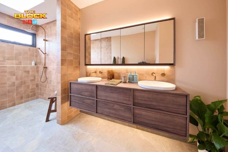
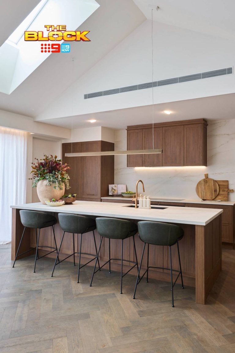
Firstly I’d like to start by saying I love the terrazzo style tile Courtney and Hans used even if it’s not real it it is stunning and the ensuite was lovely it was just missing that little something as it was so white and bright (except for the terrazzo) it needed some softening with maybe some timbers incorporated into the styling !
As for Norm and Jess I hated the choice of marble it is definitely far to intense and I don’t think I’ve ever said that about marble, I felt the entire ensuite to be all wrong it looks cheap I hate the cabinetry and the space is far too small !
Kerri and Spence did a good job it was sophisticated though I feel a tad too pulled back and as they are the richest team I wanted too see that extra touch of luxury though I’m being picky and again picking but they should have used black toilet paper I don’t think I need to explain why and that stood out more than the vanity gap. Love the mirrors but also can’t stand the fact that the two sides of the wall above the vanity are a different size !
Sara and Hayden hmmm I do feel for them !
I absolutely love the bath and I’m a huge fan of brass but there is too many textures in this ensuite and for me a herringbone floor in my opinion is a massive no no! I would change everything just to much that bath even though I like the fixtures. I would have loved to see a black and gold marble used in that ensuite on one of the walls and on top of the vanity I have an image in my head of what that ensuite could of been, it was too dark but darker ensuites don’t bother me when done right !
Bianca and Carla ! Well I’m unsure about this bathroom also and I keep wondering weather it’s because of that mirror? Maybe if it had rounded edges it would work or if they did something similar to Kerri and Spence !
We had chosen Sara and Hayden’s floor tile just the other week for our ensuite! It’s beautiful, and great to see it properly on the floor. The tile behind the bath is awful though. I don’t think it fits in the room at all. The bath was definitely a mistake too.
I think Kerri and Spence deserved to win. Their bathroom is classy and timeless. I too am a bit disconcerted by the uneven tiles on each side of the vanity. The terrazzo is awful in any colour. I really don’t like the timber vanity in the girls bathroom or the big slab of marble they used as the benchtop. It is just too thick and bulky. I thought Sara and Hayden’s bathroom was actually nice – if the bath had been all black. But she carried on like such a pork chop, I will never like anything they do. Ever. How many times did she say embarrassing? The only embarrassing thing was her behaviour.
Honey, correct me if I’m wrong but it’s not terrazzo, it’s porcelain look terrazzo. Two totally different products.
One is expensive, stunning, timeless Italian crushed marble – takes a week to install due to the weight and skill required to ‘stack’ each layer. When you see it installed you could spend your life looking at it.. I must send you pics of my current project.. it’s beyond beautiful..
The other (terrazzo ‘look’) – horrifying and should never be confused with the real stuff – also rarely would real terrazzo be 600 x 600 due to its weight. From what I can see 600 x 600 are being used on the block – so my guess it is the cheap $37pm2 terrazzo look from Beaumont and not actual $120pm2 Italian Terrazzo…
Maybe I’m wrong, if not I look forward to winning the $100
I was a bit torn by Kerry & Spence and Carla & Bianca, both really beautiful and clean. But think Kerry & Spence just pushed past, I’m a sucker for a crisp white bathroom with some contrasting elements. The marble was just right as well, Jess & Norm’s I found the veining a tad too dark and overwhelming (especially covering such large area at times). Did love Bianca & Carla’s towel rail (who wants to fold their towels after every single use?) and marble.
Would’ve liked someone to have done a pop of colour in one, like a nice blue or green… but spose that can be a bit polarising and difficult to change out for a buyer.
Thank you for speaking out about Terrazzo! I thought I kinda liked it but now Ive seen this dark terrazzo it has turned me right off it especially how it reminds me of grubby public toilets! Hayden and Sara were judged too harshly and felt their pain. Their bathroom could have been tweaked a bit by adding more contrast eg white tiles behind the black vanity and white tiles on the opposite wall Loved the winning bathroom Paired back luxury is what I’m talking about Shut up and take my money with those mirrors and herringbone Except my OCD is killing me with that asymmetrical vanity and window not centred across it then basket shoved under to balance it out??? ♀️
Honestly, I wish someone had used colour (maybe a beautiful painted cabinet?)
I did love Spence & Kerry bathroom as I found they used the space best. I really disliked Sara & Hayden’s bathroom. Just. Too. Dark.
While there were def some great elements- herringbone in one, beautiful marble in another, divine vanity etc, not one was original. They’re all cookie cutter Pinterest variations on the exact same thing. I know they need to appeal to the masses but there is nothing surprising in any of them. While I don’t hate Sara’s bath, I think the room lacked finesse. Go dark – good effort to be different – but it just didn’t work with too many “look at mooiiii” elements. Mind you, it’s easy for me to say while I sit here scrolling through Pinterest and criticising front the comfort of my sofa- good on them all for having a go. I kind of wish someone really went out on a limb. Wouldn’t it be delicious if someone really went on the wild side?
Totally agree with you on the terrazo. My Mum and dad have it in their laundry straight from the 50s – it has a dull yellow background with green flecks through it. The gold bath seems maybe a bit Hollywood retro to the polite me – but I hate it. And I love that vanity too but somehow the rest of the bathroom seems too cold, it probably needed more timber.
I couldn’t figure out why I hated the terrazzo so much and then you pointed it out – it’s an exercise book of my childhood! They should use one and take notes of why NOT to use it again.
The bathtub of Sara and Hayden seemed like such a waste of resources – I have literally never bought or rented a house based on the bathtub. It’s about the vibe and that bathtub is not a good one…
I agree with you about Kerri and Spence – I will be joining you in the group meditation you will be leading to combat OCD of all things not balanced and equal.
I personally loved Bianca and Carla’s bathroom. I love the warmth that the wood gives to an otherwise quite cold room, and the half marble wall seems to flow beautifully with the other bathroom. They complement each other without being too similar.
Overall, this week was much more encouraging than last week. Bring on the master bedrooms this week!