All week I’d been hearing things about the House Rules 2020 Tanya and Dave reveal. Word on the street was that it was the best reveal House Rules has produced. But did it really live up to the hype?
This week I’m going to give you my usual truth bombs, no holding back. When something is great I’ll tell you it’s great. And when something is shocking I will tell you it’s shocking. I’ve compared bedrooms to brothels in the past in my House Rules recaps. And in 2018 I called one of the ensuites a sex den where cheap adult films are made. So I figure we’re too far into the journey for tip-toeing around the truth.
But you know what, you guys? This week, it was actually good. The reveal was pretty stellar. It can’t be denied. Credit where credit is due, after all. While the home is not without its faults, it is pretty accurate to say that it’s one of the best reveals the show has produced.
So let’s dive further into the House Rules 2020 Tanya and Dave reveal and look at what worked (and what didn’t!). If you missed last week’s House Rules reveal judging, click here to give it a look.
Best: The Kitchen, Living & Dining
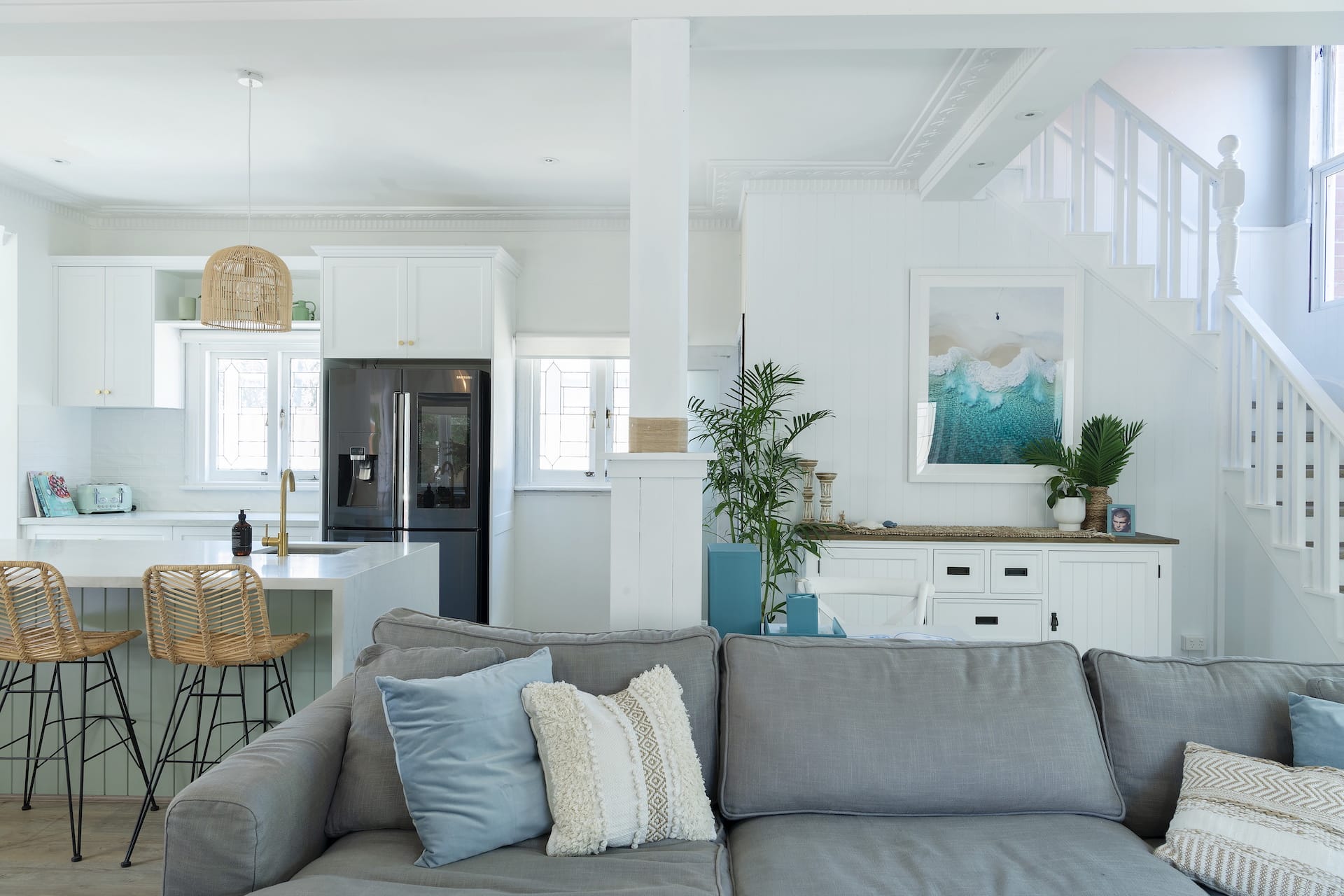
Without a doubt, the open plan kitchen, living and dining room is the best zone from Tanya and Dave’s reveal. We’ll get to what’s not working in a moment (hold your horses!), but let’s first focus on all of the positives from this reveal, because there was a lot to love.
Firstly, the vibe
There’s no denying that it all feels wonderfully lived in. The three spaces all have heart and they all feel connected. You can feel the soul in these rooms. It’s almost as if they’ve been this way for years. It doesn’t feel like a whole host of newly-purchased furniture and decor has just been thrown into the room, which can happen a lot of these sorts of shows. The zone has a story, it feels rich and layered.
There’s a lovely sense of balance between colours, textures and styles as well. The colours are lovely in that there’s a blend of cool and warm tones. Texturally, there are pieces that are hard and soft, smooth and rustic, glossy and matte. And then when it comes to the style it’s a great blend of themes: coastal, boho, Hamptons, art deco. I’m really pleasantly surprised with what was produced here.
The built in banquette seating in the window areas are lovely too. And I actually don’t mind the crafty elements like the beams wrapped with rope/twine. You can get away with that kind of thing with this design style.
What wasn’t working
It all came down to function more than anything. The TV is the living room is so high that you’d need a physio on speed-dial after watching a movie. Then you have a dining table that seats nine or 10 people, but a living area that seats three or four.
The layout needs a bit of a re-work. It’s breaking a few of my common open plan layout mistakes. Have a read if you want to know if you’re breaking them at home too.
Almost There: The Master Bedroom
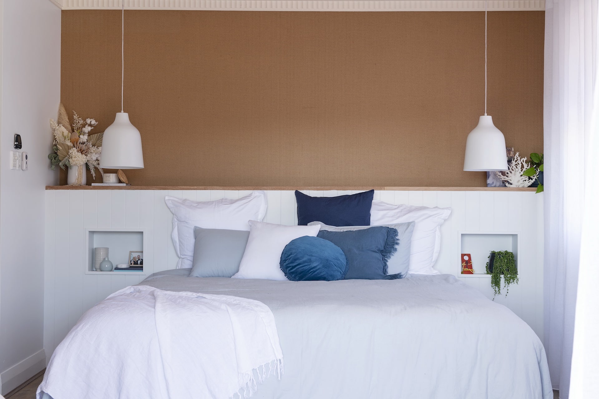
There was a lot to love about the master bedroom. And to be fair it’s about 90% there, so I don’t want to pick it apart too much. They did a good job with this one.
The colour palette is so wonderfully calm and soothing. I always say you want your bedroom to be either etherial and serene, or dark and moody. Here they channeled the former and it does feel like a relaxed space to retreat to. The blues and whites playing together feel divine, and it’s been balanced out by warmer beige tones in the flooring.
The ceiling rose gives me heart palpitations in the best way possible. I love a home that features this blend of new and old. And I love the French doors leading outside, draped with gorgeous sheers which cast a beautiful light across the room.
There are two things I take issue with though
The lack of bedside tables, and the weird feature wall above the bed.
A master bedroom without bedsides is not a master bedroom. There, I said it. You might be able to get away with it in a smaller guest bedroom, but here it’s just not cricket (that’s the only sports reference I know btw, so don’t expect more).
The pendant lights are lovely but they’re suspended over nothing. What’s that all about? The niches they created in the wall are not replacements for a bedside. They’re just not.
Now, onto that feature wall. It looks like a wallpaper, right? You know I’ve posted feature wall ideas for bedrooms on the blog before, so I very much love them in a space like this. But why no art on the wall above the bed? It looks unfinished. That said, it’s an easy fix. Just pop up a coastal print.
Winners: The Bathrooms were all Lovely
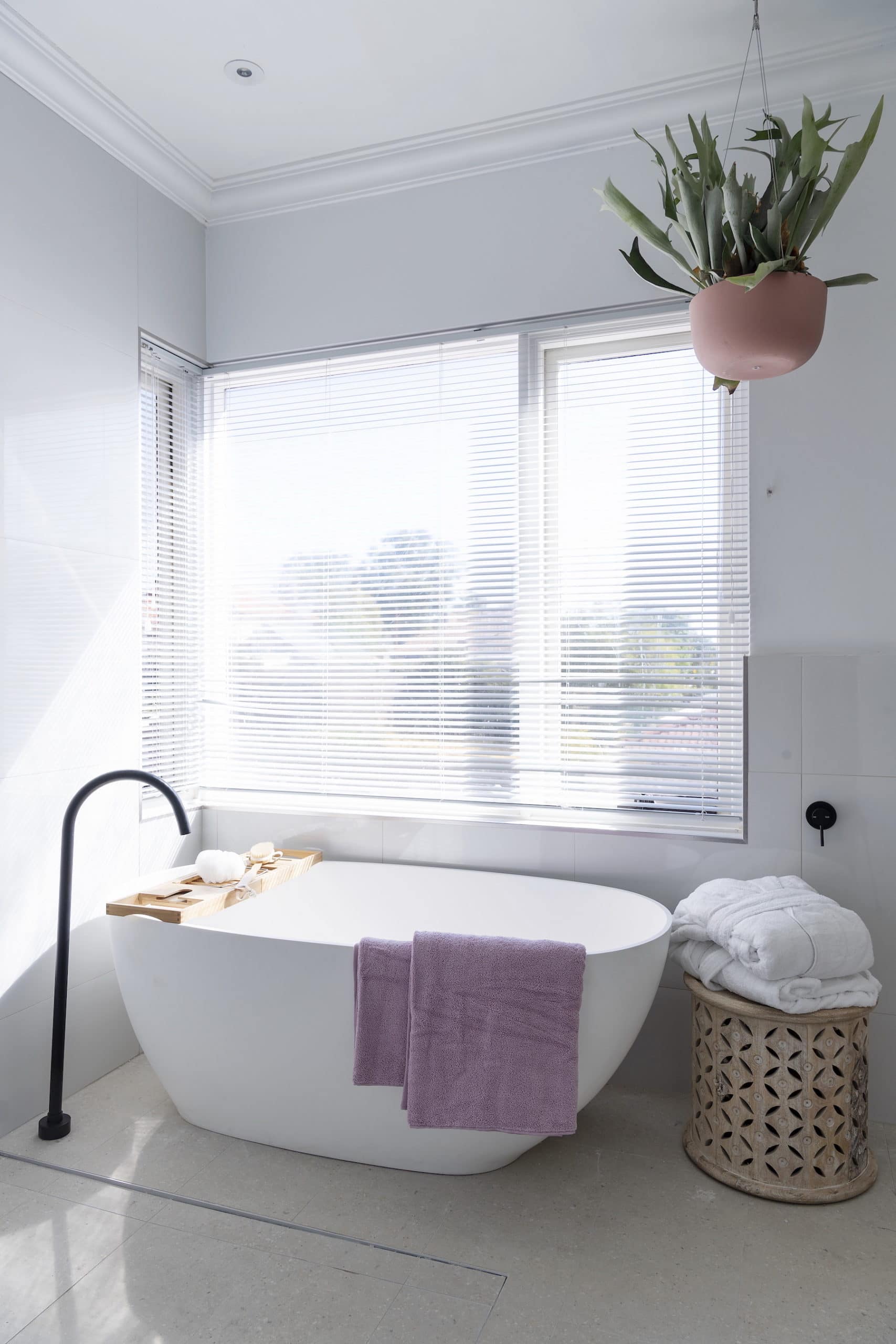
Let’s ignore the drunk tap in the bathroom above. I don’t know what his story is, but like with most people who are so drunk they can’t stand up straight, I’m just going to smile and hope to God I don’t have to interact with it.
All of the bathrooms were pretty lush though right? The vibrant blue one a bit further up was executed with some true design bravery. I posted recently on 10 bold paint colour ideas for homes and this sort of blue was part of the edit. So I do enjoy a rich colour like this. It very much taps into the Hamptons vibe of the home and I adore the VJ paneling as well. It really suits this style.
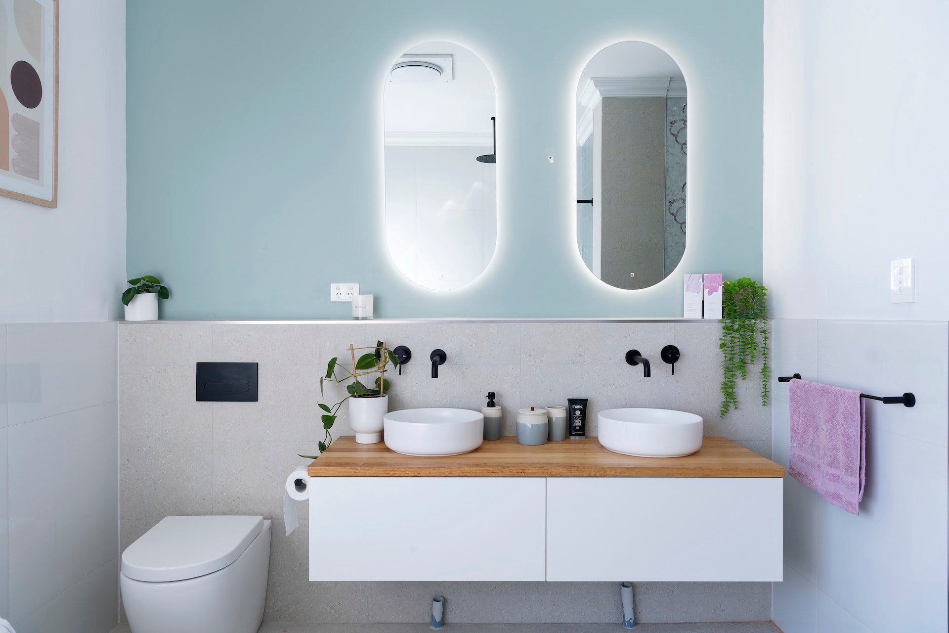
In the bathroom you see directly above and below, the colour palette is very successful. It feels fresh and radiant. I love the backlit mirrors (one of this year’s top 8 bathroom design trends) and the oval shape is very chic indeed. I’m also crushing hard on the round basins, floating vanity and matte grey feature tiles.
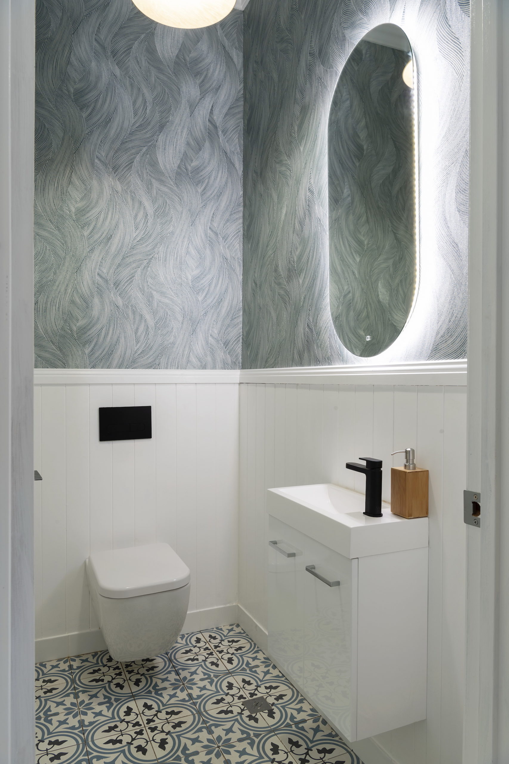
Even the powder room looked great. It’s not my favourite wallpaper design for this style of home, but good on them for being daring without it going dire.
Kids Rooms: A True Mixed Bag
Kids rooms are always an interesting one to review on shows like House Rules. I find they always go one of two ways: quite unique with fun elements kids would love, or so so boring you’d hate to be sent to your room as punishment.
This week’s reveal had a bit of both.
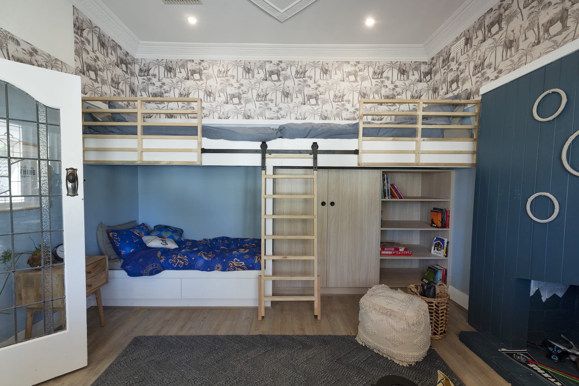
The bedroom above is by far the only good one of the week. And it really is quite awesome. Glass door aside (talk about spying on your kids!) the space is a stunner. Three built-in bunk beds, a cool ladder, a wicked colour palette, loads of storage underneath, and fun wallpaper. There’s nothing to gripe about here. I would have killed for this sort of room as a kid. It is fun but also mature.
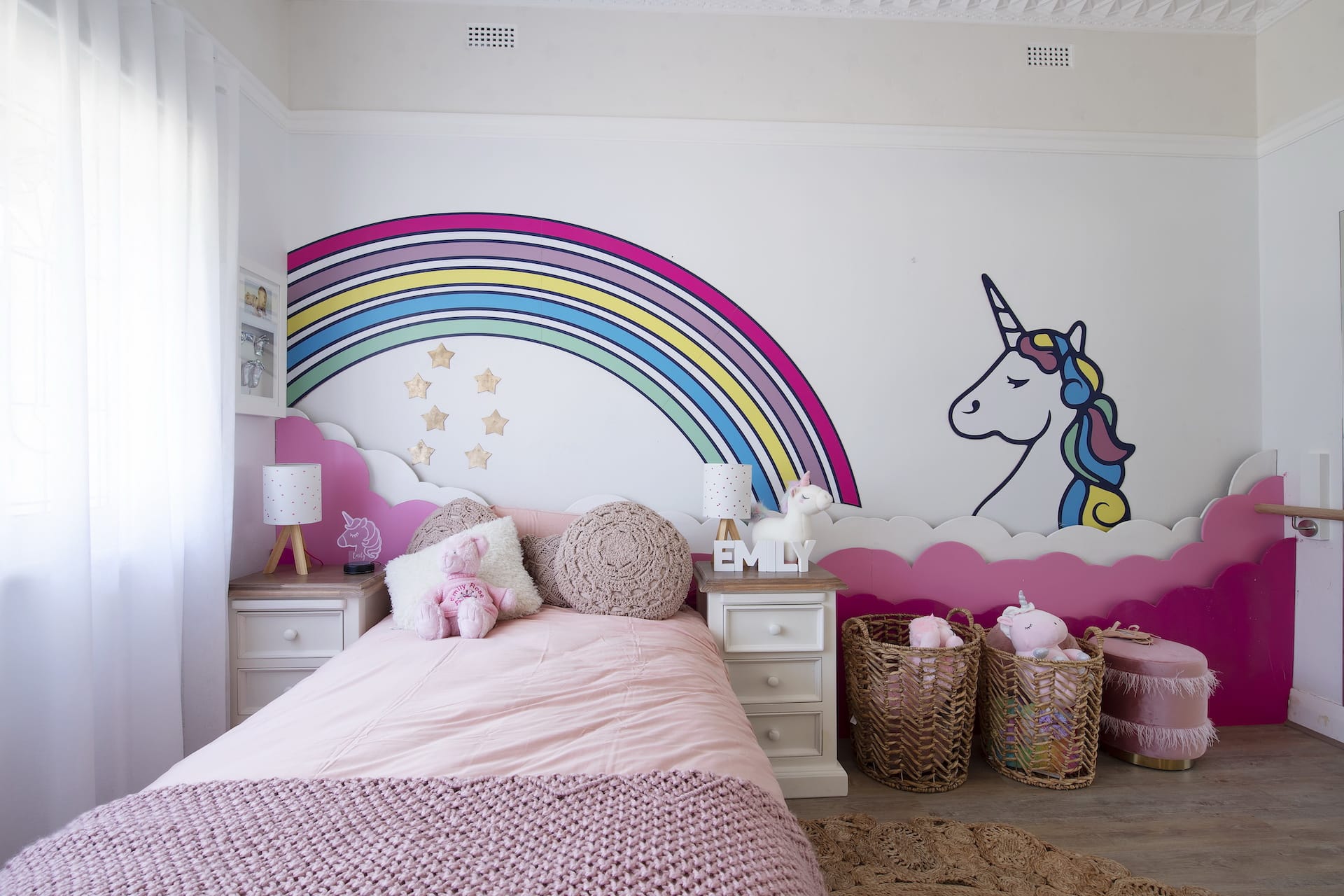
The other rooms were a bit meh. The girls room below is fine. I’m sure a little girl would love it. But it’s so ‘girls room 101’. It’s everything you’d expect it to be. I love when contestants on these reno shows bring something truly unexpected and magical to the table. Sadly here they didn’t.
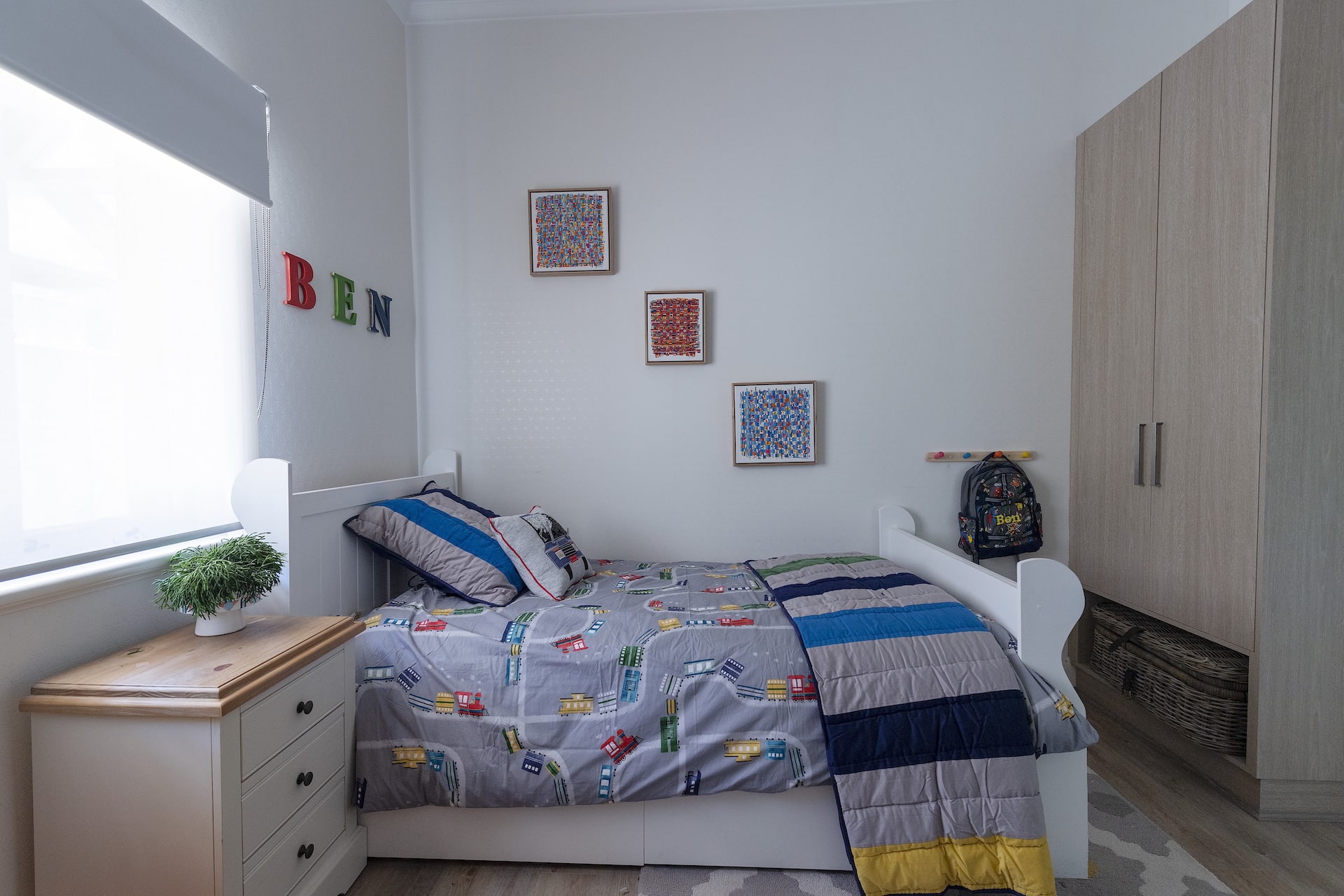
The boys bedroom further down is rather unsuccessful too. Imagine laying in your bed with a cupboard to look at. Poor thing.
What’s Your Take on this Week’s House Rules Reveal?
What did you make of the House Rules 2020 Tanya and Dave reveal? I don’t want to be the only one dropping truth bombs here.
I’d love to hear from you in the comments section below. Drop me a word and tell me which room worked for you and which room let you down.
And tune in next week as we judge the next batch of room reveals.
House Rules 2020 airs Sunday 7pm and Monday – Tuesday 7.30pm on Channel 7.
Click here to see clips from the show.






Do you know the exact colour of that blue in the bathroom? It is spectacular.
I don’t I’m afraid Sharon. Although I do know each season there is a House Rules website that shows the suppliers each week of products used in the rooms. So if you jump on Google you should be able to track it down. Good luck (it is a gorgeous blue right!?)
Does anyone know where the 3 tier cane side table in the bathroom is from? It’s perfect for a spot I’ve got but can’t find it anywhere!
I’m sorry but everything seems cheap and outdated. Doubt if this show will be back next season. The best thing about it is your Blog each week and this week you were too kind.
I hope mother enjoys cleaning the 3 basins and wet vanity from 3 kids. why on earth 3. they are low and the mirrors are high. The wall colour is delightful.
Lol!
I don’t like the lounge sofa extending past the pillar. The space could have accommodated 2 x 2 seaters with an ottoman to move around accordingly. with the tv on that angle and heat that rises, good luck if it last 2 yrs. the study and hallway were boring looked like grandma had decorated then. I absolutely adored those beautiful glass/leadlght doors throughout, but they could have done much better to cover them permanently on the bedroom sides.
I just don’t like this season at all. I’m not really liking any of the couples or their styling. It feels like a huge step back after the last couple of years. Two of the kids rooms were horrible!
Fair enough!
Thanks again Chris for your lovely updates, points of view & how often we are exactly on the same page…I choose to look at your pics first, draw my conclusion, & then read your remarks…. time & time again we agree…Its my game and I enjoy that Im spot on…
Luv your work! 🙂
Love that we’re on the same page, thanks!